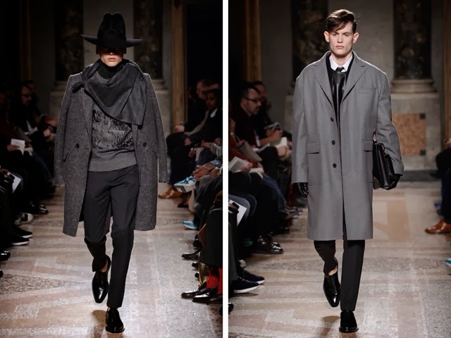
Being relatively new to the high end, menswear design sector, LES HOMMES seem to be in good grasp of what we all want to see in the new season. However they seem to have taken it a little further, and with a twist you wouldn't usually see.
The brand was founded not song long ago, by (at the time, university students) Tome Notte & Bart Vandebosch. The pair both ended up studying fashion at a high level, however Notte studied Economic Science before landing into fashion, opposed to Vandebosch, who had a ore-existing artistic background. The pair graduated from the Royal Academy of Fine Arts in Antwerp.
Both designers are very charismatic, with matching personalities, and this can if course be reflected in their work. Now I can relate to this particular collection on a personal level. Myself, I wear a lot of dark shades, bearing strong chiaroscuro (which I partly think matches my soul, on a darker level) and this collection shows just that. Below I have sourced some of the mood that the label used to inspire the collection:
As I mentioned before, the main focus seems to have a deep bearing of chiaroscuro, with entirely monotonous pieces. This of course is a good thing. You see in the image there is a deep contrast between light and dark tones. This is eccentuated by the very sharp edges at which the tones separate and do not blend. Looking back at the collection, I'm sure you can now appreciate where my mind is...from an artistic point of view.
I love everything in this collection (minus the hat in a certain outfit that somewhat resembles a character from 'Kill Bill' or perhaps 'V For Vendetta') they all breathe such definition, power and integrity. I really do see this line as more of an art form that I do a series of clothing.
From the start of the show, by the music and lighting you could almost instantly tell that this collection was to be bold and bear a statement, however you wouldn't expect it to be so dark. A prominent PowerPoint seems to be oversized jakcets, and accessories such as hats, and scarfs which almost seem to embellish the models and overcast their features. Everything about the line is mysterious and of course interesting, very high skilled tailoring is also a key factors, and this allows the stylist to be able to match something which drapes against such items that are fitted and sculpt the body.
Then, we have a look at their campaign for the URBAN sections of the brand. A section that seems to think it would be their likeliness of 'VERSUS for Versace' never the less, this stands at he complete opposite side of the spectrum. This line channels nothing but a sensual channeling of brands such as Hollister, Abercrombie & Fitch and all those disgusting pre-teen stores. SOME of the items aren't too bad, such as their tailoring and a small portion of their knitwear, however the campaign reeks of that fake, ripped body, benefit scraping, Cali/surfer boy attitude.
I highly suggest boys, that you ditch the side label until you're more distinguished, and focus more on developing the dream work you have...


0 comments:
Post a Comment