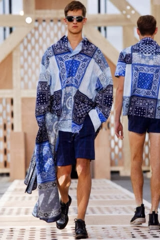
Above is the Spring/Summer '14 Michael Bastian collection. As I'm sure all you fashion forward guys, and girls will appreciate this wonderful array of clothes, whether appealing to your own fashion taste buds, or for your partner. Having been known more so by the mainstream consumers for his design work with GANT, I can defiantly see a notable difference in his work with the brand and his namesake label. Having only recently been noticed for his own haus of work I dub him as one to look for in coming years. Having recently (2011) won the prestigious CFDA menswear award, I'd say he's no stranger to success.
Focusing on this collection, I would like to personally thank Michael for bringing back the male necktie. (Neckties are pocket squares are my clothing G-spot) and of course, keeping models beautiful and behind doable. Seeing as I'm such a fan of this collection, and in would wear everything in it, I'll do you all an outfit by outfit breakdown. 7/10
1: A very bright and striking combination to start with, you are immediately drawn to the bold print on the trousers, which also takes away the 'business' factor and makes the outfit casual. You then pan up and focus on this grey, light tweed blazer. Sewn in an inch or two above the lower back segment and perfectly around the shoulders, gives us a little smart edge back to the outfit. Then (if you're not too distracted by this gorgeous human being) your attention is drawn towards the shirt, obviously being quite simple as anything other than a light simple shirt would lash with the trousers. The shirt itself gives us a smart feel, which being open to a deep vee make it less so. Then the think red leather belt matches the leather straps on the bag and also the leather lining on the top of the boat shoe. Noting that the shoe isn't matching but instead contrast with a bold, but not so harsh, dark navy gives us a little more depth and accentuates the main garments. Overall 8/10
2: Darker than the first, this outfit sees a lot more contrast that it does fluidity. The strong block colours on the too half define its importance, and of course takes your attention straight to it. I am however, so glad that the sleeve cuffs are unbuttoned and halved back. (This is something I do a lot, and tend to feel like I'm about to conduct an orchestra) The necktie and half matching belt also add a lot to the outfit, but in more subtle ways. They don't make a stamens appearance but instead, add subtle depth to the outfit, almost giving the illusion of more layers. However the necktie...orgasm. Downstairs we see a washed grey leopard print trouser, now if they were tailored I would be inclined to disagree, but I do like the outfit with the only slim fitting print. I wouldn't however personally choose the print itself. I would then go into discussion on whether the shoes compliment or degrade the outfit but I can't make them out too well. Let's just say, Walter would want them back.
3: I love, love, love this outfit...but I'm confused as to why thick knitwear is being showcased in a SS collection, more importantly paired with shorts in the same outfit, BUT oddly it works! I'm sure you agree. Perhaps it's like chocolate and chilli, it sounds disgusting, but out them together, and it's a winner! Not much to focus on here, but the thick crimson jumper flows well with the black collar underlay, something we have seen time and time again in recent years, but always looks good with the right outer layer. I think the shorts work as they're more of a pastel colour opposed to a block. It's again breaks up the outfit but allows it to flow through. THEN, we come to the shoes, now I love good shoes, but I'm not the most avid fan of male shoe design, but there are absolute beauties. They bear resemblance to Persian slippers. An item which crept into mens fashion almost thirty years ago, and every decade come back spontaneously. Overall 9/10
4: the penultimate photos shows, yet again one of my favourite outfits. Saying that is a little contradictory as I couldn't choose a favourite out if the five above! Contrasting lapels are becoming really big in tailoring, and even more exciting is a characteristic material such as tweed, wool or harrow against contrasting lapels. This is a perfect example, as you can see, the light material has a very feint contrasting charcoal pattern. This adds to the character of the jacket keeping it casual and informal. Very simply matching the outfit are black matte, half tailored trousers. They see to have a very slight drop in the crotch area, but not enough for them to be tailored drop cloth. Then matching black shoes gives a very tidy finish. Contrasting is the white shirt and white pocket square, for this looking both of the white items (be they the shirt, or on the other hand, the blazer and trousers) need to be crisp and perfect in order for the item to work. Overall 9.5/10
5: so, last, but by no means least is my future husband, modelling a gorgeous, enthral thing, yet slightly daring outfit. To any of us it would seem like a walk in the park, but bare in mind the target audience for this brand is in fact straight men. As adventurous as the colour and pattern may be, it's still appealing. Of course this beautiful tailored jacket with a shine finished and braised, gold buttons and matching shined shoe combination is a winner, but throw in some bright red pants with ornate 60's swirls, and of course most guys would shudder at the thought. Not this, although you can't see, the detailing on the pant is actually very thin, small gold detailing. This wouldn't normally be as evident as it is when photographed. Even though you can't see the detailing too much, when you do, it's a perfect match with the buttons, something even more appealing. Another favourite of mine is the contrasting bottom lapel on the trousers which subtlety match with that of the shirt, giving it an all round thick and bold feel. An amazing completed outfit. Overall 10/10.
There you have it, a very detailed and opinionated insight into the SS14 collection of Michael Bastian. I do commend any of you who have read this in its entirety. I didn't exactly skimp much this time, overall the collection and work base truly deserves it. Never the less what's the say this was a knee shot, and the brand doesn't suddenly fall into a pit of a creative abyss? Unlikely, but still a possibility.